

Everyone loves Strawberries. If you like bowls full of them, then you should buy this, it's really tasty and everyone will be jealous. You can put them in salads with feta or with icecream.
More informationBuy nowEveryone loves Strawberries. If you like bowls full of them, then you should buy this, it's really tasty and everyone will be jealous. You can put them in salads with feta or with icecream.
More informationBuy now
White flowers are for peace, so if you're fighting with someone, maybe you should buy them this?
More informationBuy now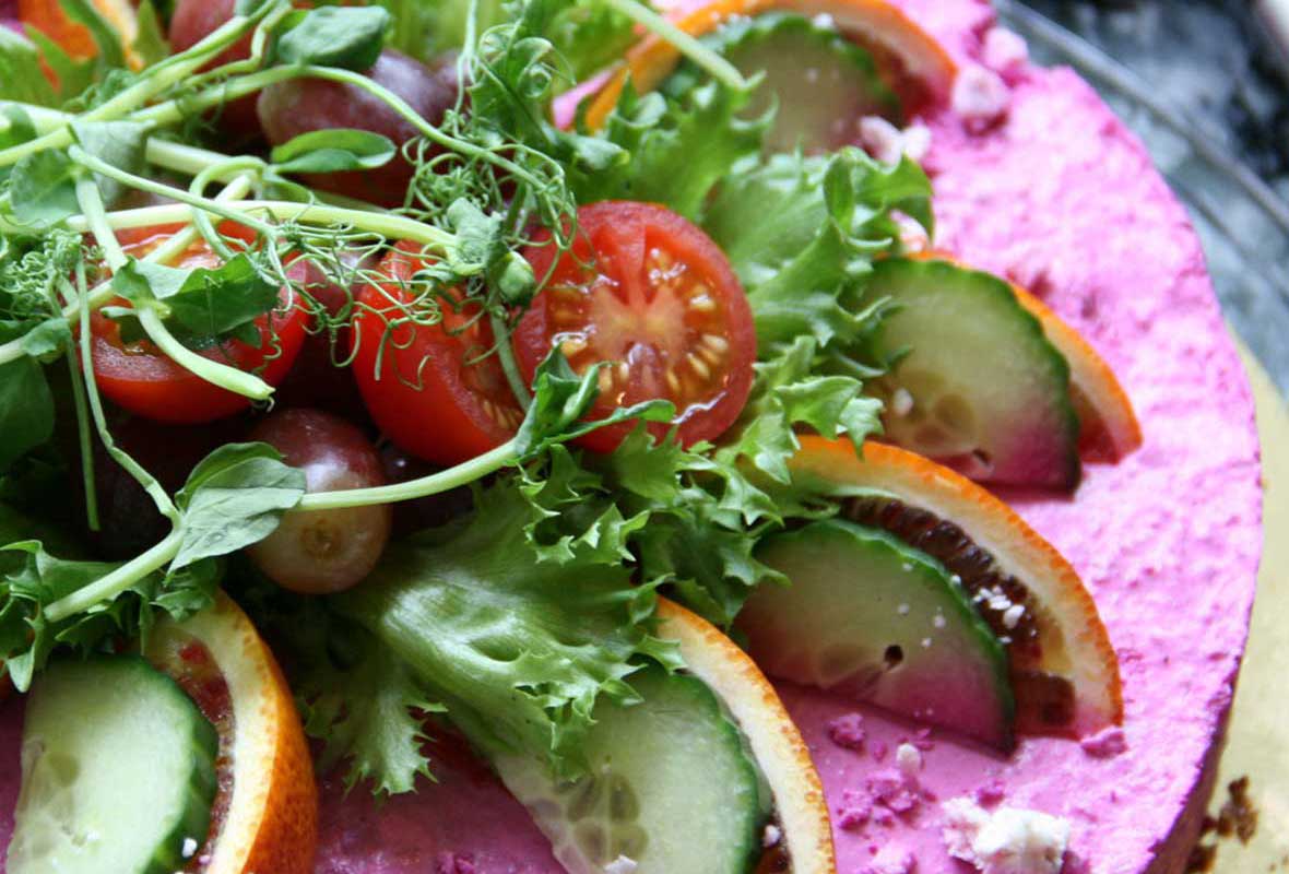
Savoury cheesecake? What?! It sounds amazing to me! Throw on some walnuts and it's like a goatcheese, beetroot and walnut salad in cake form. Mmmmm cake.
More informationBuy now
Thinking of giving someone some red roses? Did you know that in some cultures red roses are given to the mistress, while yellow roses are given to the true love? Save some awkwardness, go yellow.
More informationBuy now<section class="shop">
<h2 class="restricted-width">Shop</h2>
<section id="shop-demo">
<article title="Strawberries">
<div class="image-content"><img src="/assets/img/image-5.jpg" alt="demo1_2" class="product-image"></div>
<div class="product-info">
<p>Everyone loves Strawberries. If you like bowls full of them, then you should buy this, it's really tasty and everyone will be jealous. You can put them in salads with feta or with icecream.</p>
<a href="#!" class="button-link more-info">More information</a><a href="#!" class="button-link buy-now">Buy now</a>
</div>
</article>
<article title="White flowers">
<div class="image-content"><img src="/assets/img/image-6.jpg" alt="demo1_2" class="product-image"></div>
<div class="product-info">
<p>White flowers are for peace, so if you're fighting with someone, maybe you should buy them this?</p>
<a href="#!" class="button-link more-info">More information</a><a href="#!" class="button-link buy-now">Buy now</a>
</div>
</article>
<article title="Beetroot and goat's cheese cake">
<div class="image-content"><img src="/assets/img/image-7.jpg" alt="demo1_2" class="product-image"></div>
<div class="product-info">
<p>Savoury cheesecake? What?! It sounds amazing to me! Throw on some walnuts and it's like a goatcheese, beetroot and walnut salad in cake form. Mmmmm cake.</p>
<a href="#!" class="button-link more-info">More information</a><a href="#!" class="button-link buy-now">Buy now</a>
</div>
</article>
<article title="Yellow flowers">
<div class="image-content"><img src="/assets/img/image-8.jpg" alt="demo1_2" class="product-image"></div>
<div class="product-info">
<p>Thinking of giving someone some red roses? Did you know that in some cultures red roses are given to the mistress, while yellow roses are given to the true love? Save some awkwardness, go yellow.</p>
<a href="#!" class="button-link more-info">More information</a><a href="#!" class="button-link buy-now">Buy now</a>
</div>
</article>
</section>
<h2 class="product-name"></h2>
</section>
jQuery('#shop-demo').slippry({
  // general elements & wrapper
  slippryWrapper: '<div class="sy-box shop-slider" />', // wrapper to wrap everything, including pager
  elements: 'article', // elments cointaining slide content

  // options
  adaptiveHeight: false, // height of the sliders adapts to current slide
  start: 2, // num (starting from 1), random
  loop: false, // first -> last & last -> first arrows
  captionsSrc: 'article',
  captions: 'custom', // Position: overlay, below, custom, false
  captionsEl: '.product-name',

  // pager
  pager: false,

  // transitions
  slideMargin: 20, // spacing between slides (in %)
  useCSS: true,
  transition: 'horizontal',

  // slideshow
  auto: false
});
/* Shop */
@media only screen and (min-width: 401px) {
  .shop .sy-box .sy-slides-wrap {
    min-width: 400px;
    max-width: 590px;
    width: 50%;
    margin-left: auto;
    margin-right: auto;
  }
}
.shop .sy-box .sy-slides-crop {
  overflow: visible;
}
@media only screen and (max-width: 500px) {
  .shop .sy-box .sy-controls li {
    min-width: 2.4em;
  }
  .shop .sy-box .sy-controls li a:after {
    line-height: 1.4em;
    height: 1.4em;
    width: 1.4em;
    margin-top: -0.7em;
    margin-left: -0.7em;
  }
}
@media only screen and (min-width: 501px) {
  .shop .sy-box .sy-controls li {
    width: 100%;
  }
  .shop .sy-box .sy-controls li.sy-prev {
    left: -100%;
  }
  .shop .sy-box .sy-controls li.sy-next {
    right: -100%;
  }
  .shop .sy-box .sy-controls li a:after {
    background: none;
  }
}
.shop .sy-box .sy-slide {
  opacity: 0.6;
  -webkit-transition: opacity 1s;
  -moz-transition: opacity 1s;
  -o-transition: opacity 1s;
  transition: opacity 1s;
}
.shop .sy-box .sy-slide .product-info {
  position: absolute;
  top: 0;
  left: 0;
  height: 100%;
  padding: 1em;
}
@media only screen and (max-width: 500px) {
  .shop .sy-box .sy-slide .product-info {
    padding: 1em 2.4em;
  }
}
.shop .sy-box .sy-slide .product-info p {
  margin-bottom: 1em;
}
.shop .sy-box .sy-slide .product-info p, .shop .sy-box .sy-slide .product-info .button-link {
  opacity: 0;
}
.shop .sy-box .sy-slide .product-info .button-link {
  position: absolute;
  bottom: 1em;
}
.shop .sy-box .sy-slide .product-info .buy-now {
  right: 1em;
}
@media only screen and (max-width: 500px) {
  .shop .sy-box .sy-slide .product-info .buy-now {
    right: 2.4em;
  }
}
.shop .sy-box .sy-slide .product-info .more-info {
  left: 1em;
}
@media only screen and (max-width: 500px) {
  .shop .sy-box .sy-slide .product-info .more-info {
    left: 2.4em;
  }
}
.shop .sy-box .sy-slide .image-content {
  line-height: 0;
}
.shop .sy-box .sy-slide .image-content .product-image {
  max-width: 100%;
}
.shop .sy-box .sy-slide.sy-active {
  opacity: 1;
}
.shop .sy-box .sy-slide.sy-active .buy-now {
  opacity: 1;
}
.shop .sy-box .sy-slide.sy-active:hover .product-image {
  opacity: 0.2;
}
.shop .sy-box .sy-slide.sy-active:hover .product-info p, .shop .sy-box .sy-slide.sy-active:hover .product-info .button-link {
  opacity: 1;
}
.shop .sy-box .sy-slide .product-info p,
.shop .sy-box .sy-slide .product-info .button-link,
.shop .sy-box .sy-slide .product-image, .shop .sy-box .sy-slide.sy-active, .shop .sy-box .sy-slide.sy-active .buy-now, .shop .sy-box .sy-slide.sy-active:hover .product-image, .shop .sy-box .sy-slide.sy-active:hover .product-info p, .shop .sy-box .sy-slide.sy-active:hover .product-info .button-link, .shop .sy-box .sy-slide.sy-active.transition {
  -webkit-transition: opacity 1s;
  -moz-transition: opacity 1s;
  -o-transition: opacity 1s;
  transition: opacity 1s;
}
.product-name,
.shop-slider .slide_box {
  width: 100%;
  margin-left: auto;
  margin-right: auto;
}
@media only screen and (min-width: 401px) {
  .product-name,
  .shop-slider .slide_box {
    min-width: 400px;
    max-width: 590px;
    width: 50%;
  }
}